Thursday, March 31, 2011

Variations On A Theme

Lately I have been working on creating a bunch of butterfly themed cards for a women's group I am part of. Our little "motto" is "Find your wings and keep them." These cards are going to be used for each woman to send a note of encouragement to someone they think needs to be uplifted throughout the week. Here are a few of the cards I finished today using some of the Copic colored butterflies I shared with you yesterday... This first card was created using the Divine Swirls embossing folder from Cuttlebug. I dotted each swirl tip with white gel pen. I also used the white gel pen for accenting the butterflies and hand writing the sentiment.

The following card was also created using the Divine Swirls embossing folder. The ends of these swirls were also dotted using a white gel pen. The butterflies were accented using Lavender Stickles (this was my first time trying Stickles... let's just say I'm in LOVE). The sentiment is hand written in white gel pen.


This next card was created using the Stylized Flowers embossing folder from Cuttlebug and sanding the raised parts. The butterflies were accented with Liquid Pearls in Rouge.


All butterflies are from the Antique Engravings set from Hero Arts (CL383) and are colored using Copic markers (for information on exact markers used, please visit yesterday's post. Thanks for letting me share!


As always


Angela

Wednesday, March 30, 2011

Butterflies, Copics and Scissors... Oh, My! (Again)

This is something I like to do when I'm doing craft time with my precious little 2 1/2 year old daughter... I stamp a bunch of images and then color them with Copics while she paints. Not only is it fun and relaxing, it's also a great way to prep a lot of images for future use. I just got this great stamp set with my Hero Arts order a couple days ago. It's called Antique Engravings (CL383) and I LOVE it! These butterflies are so great. The inspiration for these came from this youtube video by Jennifer McGuire. Here they are all cut out... I just love how vivid they are! Here are the Copic colors I used:

  • Purple butterfly: V12, V15

  • Gray butterfly: W-3, B63

  • Red butterfly: R22, R35

  • Yellow butterfly:Y17, YR68

  • Butterfly body: E57
And here is a card I created this evening using one of the gray butterflies...

I embossed a lovely gray textured card stock from my Neutrals Mat Stack (DCWV) with the Divine Swirls embossing folder from Cuttlebug. I then used sand paper to distress the raised areas of the embossed paper. I heat embossed the butterfly with three layers of Clear Ultra Thick Embossing Enamel (and VersaMark) to create a gorgeous glossy butterfly! Before the butterfly cooled too much I bent the wings up slightly to give a nice dimensional affect.


Goodies Galore!

Today was a GREAT day for crafting goodies! I found this cute little scrapbooking store in my area that carries a lot of great stuff that the large chains don't. I've pretty much tapped out the large chains so I'm trying to find smaller, locally owned stores that carry the more unique items that you can usually only find online. Anyway, after I got home, the mailman brought me my most recent joann order. Woo hoo!! Here's what I got- a lot of stuff I can't wait to play around with! 
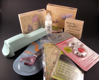
I am so excited about giving these dies a try. They have so much potential- so many uses! I also got some more grungeboard which will be great to use with my new dies! (Tim Holtz Alterations Sizzix dies: Hanging Sign and Hardware Findings). Also, as you can see in the photo above I got the larger size Craft Sheet. I already have the smaller size, but I decided it was time to upgrade to a larger surface. 
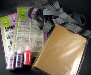
Next I ordered some more Distress Inks! I've pretty much been using the same ones for everything and I felt it was time to branch out with the colors to get a refreshed feel to my work. Only one issue came up with this order and that is I was supposed to get Victorian Velvet, but I received Stormy Sky instead. I won't complain because I did want to add that color to my collection too, but it's never cool when your order is messed up. I'll just have to grab Victorian Velvet next time. Anyway, the colors I got are (not listed in order of the picture): Mustard Seed, Faded Jean, Bundled Sage, Chipped Sapphire, Crushed Olive, Spun Sugar and Stormy Sky.

Here's something else I've been super excited to get... Perfect Pearls Mists! I saw Tim demonstrate this new product on the HSN and I was instantly enthralled. I ordered (from right to left): Forever Red, Perfect Pearl, Forever Violet, Turquoise and Heirloom Gold. There are a total of 12 Perfect Pearls Mist colors so far, but I figured these would be a good place for me to start. I also ordered a Paint Dabber in Snow Cap. I've never used one before, but I wanted to at least give it a try before deciding I didn't like it. I joined a Paint Dabber resist technique swap which gave me the perfect excuse to give it a go!

Next up are the goodies I purchased from Joys Of Life Scrapbooking. I got a couple Hero Arts clear stamp sets (Dictionary Greetings- CL479 and Made With Love- CL491), some gorgeous gray ribbon for a card project I am working on, my first Stickles (in Lavender), a couple of Liquid Pearls (in Lavender Lace and Rouge) and this really cool chipboard book from Maya Road.


On top of all that I also got to go thrift shopping today and found some AWESOME things for altering and some great things for organizing some of my supplies. See... I told you it was a GREAT day for crafting goodies!


As always

Angela

Monday, March 28, 2011

Less Is More Challenge Week 8: Sketch

Time for a favorite part of my week... the Less Is More blog challenge! This weeks challenge is a "Sketch" which is a first for me. (It's also my first DL card, which I don't even know what DL means). I've never attempted a sketch challenge before, but I love the concept! Here is a peek at this weeks sketch... In all honesty, I underestimated the difficulty. I started brainstorming as soon as I saw the sketch and came up with a concept in my head. Well, about five failed attempts later I realized it just wasn't going to happen. I gave myself a day long break to give my creative energies a little rest. Nothing was coming to me until this morning when I received my recent Hero Arts purchases in the mail. As soon as I opened my box of goodies inspiration came over me. This card is a little bitter-sweet for me... sweet because I love how it turned out and I love that I got to use some of my new stamps. Bitter because it is a card I created with a purpose- a friend of my family just lost her father. So, here is the final result...


  • Small Sweet Petals Stamp (Hero Arts-CG311)


  • With Sympathy Clear Stamp Set (Hero Arts-CL476)


  • Swiss Dot Embossing Folder (Cuttlebug)


  • Copic Markers: R22, R14, R35
The petal is adhered with dimensional adhesives so it stands slightly above the card. Also, I got to try some creative problem solving... I wanted to emboss the one side of my paper, but it wouldn't fit properly into my Sizzix because of the paper size. I positioned my folder where I wanted it then placed my paper on a couple sheets of felt. Using a bone folder I went over the embossing folder, pushing down as hard as I could. Voila! It created the embossed effect where I needed it!

Thanks for letting me share! I know I took a few creative liberties... turning the design on its side and using the flower as my "circle." However, I love how it turned out and I still think it follows the sketch guidelines! Let's hope Chrissie and Mandi agree!


As always

Angela

Thursday, March 24, 2011

Less Is More Challenge Week 7: Masculine Revisited

This weeks challenge over at Less Is More is the (somewhat dreaded) masculine card. I did make a submission earlier in the week and wasn't planning on submitting another. However, I recently ordered a little gift for my husband and it came in the mail today. I wanted to make a card that would double as a gift tag. Of course, just like earlier this week, I headed straight for my collection of Tim Holtz stamps. I also grabbed up my "Peeled Paint" Distress Ink as green is my husbands favorite color. Here is the final result...


The stars are from his Visual Artistry clear stamp set "City Central" and the lion is from the VA clear stamp set "Regal Flourish". I also used black Archival Ink.


I really like how it turned out and my husband loved his gift so I guess everybody wins!
As always
Angela

Tuesday, March 22, 2011

How Do I Love Thee? Let Me Count The Ways

A few months ago my creative life was changed forever when I happened to stumble across a YouTube video tutorial featuring someone named Tim Holtz demonstrating a product called Distress Ink. Life. Changing. I went about purchasing some Distress Inks and falling in love with them instantly. Little did I know that was only the tip of the Tim Holtz iceberg! Today I am well aware of his many amazing products... from the "Alterations" line to the "Idea-ology" line and all the glorious products in-between (Stamper's Anonymous, Ranger, Tonic, etc... Tim Holtz is a brand). This morning I received a shipment from JOANN's online store loaded with products from his idea-ology line that I am super excited to dig into and "get grungy" with, but of course I had to take time to share my new goodies with all of you!

  • 12x12 "Lost And Found" Paper Stash
  • 12x12 Grungepaper (this is actually the better deal than the 6x12)
  • 6x12 Grungepaper
  • Swivel Clasps
  • Sprocket Gears
  • Philosophy Tags
  • Jump Rings
  • Memo Pins
  • Trinket Pins

I am going to be ordering some of the new Perfect Pearls Mists too... I saw him demonstrate them on HSN and I can't wait to give them a try! I'm also ordering a couple more Distress Inks, the Hanging Sign die, a Paint Dabber (I'm a little hesitant about the Dabbers at the moment so I'll let you know how it goes), and some of the Grungeboard. I wanted to order the Tattered Florals die, but it was out of stock. I'll just grab that one up next time.

So, if you've been having fun with any Tim Holtz goodies leave me a comment! I'd love to hear about your favorite products (and even ones you may not like so much). Also, if anyone has given the "On The Edge" dies a try I'd love to hear about your experience... I'm quite hesitant to give them a try (to me they look really difficult to use). Thanks for letting me share- hope to hear from you!

As always

Angela

Saturday, March 19, 2011

Adventures (I Am Trying To Have) In... Scrapbooking!

Ok... if you know me, you know I am crazy passionate about card making and paper crafting (tags, gift boxes, ATC's, altered items, etc...). There's no doubt about it, it's just part of who I am. However, what you may not know is that I am super terrified of scrapbooking! Yes, I know... it probably sounds silly, but I just have this huge creative block when it comes to scrapbooking. I used to be able to trace it back to my fear of cutting up my photographs. See, back when this was all new to me I had this assumption that in order to scrapbook I would have to cut all of my photographs into crazy shapes or something which made me feel like I might cut out something important. I have recently learned this is not the case at all! I have been checking out a lot of scrapbooking related magazines, books, websites, etc. lately and most of what I've seen is photographs in their original shape and size or at least very close to it. I have always wanted to scrapbook and now that I don't feel terrified of having to chop up all my precious memories I have decided to give it a try!

I recently purchased the book Scrapbooking Made Easy by Simple Scrapbooks and Leisure Arts (which I believe is a magazine publication). The very first chapter covered all my fears! I felt it was a paper crafting sign. I've dug out my daughter's first birthday photos, selected the ones I want to scrap and am ready to get started! (Oh... I already had the scrapbook. I bought it about 8 months ago with this exact purpose in mind. See... I told you I have a creative block for scrapbooking)! So yes... album (check), photos (check), can-do spirit (check)! Wish me luck!

As always
Angela

Less Is More Challenge Week 7: Masculine


Ah yes... the ever elusive masculine card. That's this weeks challenge over at the wonderfully fun Less Is More Challenge Blog. I will admit I hardly ever make masculine cards. It's a little hard to admit when you're not good at something and the design and execution of masculine cards is definitely an area I could greatly improve upon. Luckily, I just received a massive ebay haul of Tim Holtz stamps I won so when I read this weeks challenge I knew exactly where to go for inspiration...
I created this first card using "The Journey" set for the vehicle and the "Playful Journey" set for the sentiment. I think it turned out to be a nice "all occasion" type of card or even a nice and simple graduation card.

The next card I created is my favorite of the two. I love this little bicycle stamp from the "Playful Journey" set, but I wanted to do something a little different for the paper. I decided to use a gold metallic finish paper as my card base. I was a little worried it might not turn out masculine enough, but because it is metallic and not sparkly it is actually quite masculine. I think the paper really takes this card up a notch. In fact, I think I am going to turn this concept into a notecard set to list in my shop. I'm glad I gave it a shot even though I was hesitant!

All stamps are from the Tim Holtz Visual Artistry clear stamp collection from Stampers Anonymous. Thanks for letting me share!

As always

Angela

Monday, March 14, 2011

Less Is More Challenge Week 6: One Layer Card- "Off The Edge"

This weeks challenge over at the Less Is More challenge blog is "One Layer Card- Off The Edge." The guidelines are simple... create a card by stamping directly on the base- no layers or embellishments- and your image must go off the edge of your base. The following card is actually the second one I created. I used the peacock from the Fiskars "Plumage" clear stamp set and created the look by stamping the image twice- once in slate blue and once in purple. I did the same with the sentiment (Hero Arts). I then did some outlines of the feathers and also the sentiment with a gold gel pen (which is a very subtle accent). I felt the two colors on top of each other would create some visually interesting depth.


This next card is my Honorable Mention. It's actually the first one I created for the challenge. It also happens to be my favorite of the two. The reason I am not officially submitting it is I felt perhaps there was not enough "negative space" for this particular blog. Part of the reason is because I used a smaller card base than usual. I love how it turned out though! I created this card by using my new Hero Arts Flower Burst background stamp inked with white chalk ink. This was the first time I used this stamp so I was pretty happy for the excuse to give it a try. The sentiment is the same as on the card above (also Hero Arts). I added some touches of silver with a gel pen (if I make it again I don't think I will do the silver) and I finished the card off with a spritz of Tsukineko's Shimmer Mist. It's not visible in the photograph, but it is such a lovely touch!


I hope you've enjoyed this weeks submissions! If I get a chance perhaps I will try a few more!

As always

Angela


Friday, March 11, 2011

Feeding The Addiction Part 2

As I mentioned before I have quite an addiction for craft supplies. I also mentioned I had another order from joann.com in the works. Well, here it is! My latest Joann order arrived today. I'm so excited because it didn't take as long as it did last time (my last package took quite awhile due to inclement weather around the US). So, what wonderful goodies do I have to share with you today? Let's see...

  • Stampabilities House Mouse Stamps: Flower Drop and Butterfly Express
  • Penny Black Stamp: Full Of Life
  • Itty Bitty Unmounted Rubber Stamp: You're A Real Fun-gi
  • Inkadinkado Mini Clear Stamp: Thanks For...
  • EK Success Stamp-A-Ma-Jig
  • Tim Holtz Paper Distresser
  • Ranger Liquid Pearls
  • Fiskars Reverse Action Fingertip Tweezers
  • Cuttlebug Swiss Dot Embossing Folder

I am especially excited to use my paper distresser because I have been doing a lot of Tim Holtz inspired paper projects lately (tags, ATC's, inchies, etc...). I think this distresser will add a great touch to my finished items (which I will gladly share with you here). I have also been heat embossing a lot lately (using clear Ultra Thick Embossing Enamel) which is why I got the reverse action tweezers- to hold whatever I am embossing at the moment. I am so excited that a product like the Stamp-A-Ma-Jig exists because rubber stamps have always intimidated me simply for the fact you can't see exactly how the image is going to line up on your surface. With this tool, it takes all the guess work out of it and provides for accuracy when stamping! As for the other items... well, how cute are those House Mouse stamps!? Looking forward to making some great spring and summer cards with them. I love the look the swiss dot embossing folder provides... especially as a background. It really adds a luxurious feel to cards. The smaller stamps are just some sute ones I added on last minute to come out to the minimum required to use my free shipping coupon, but I look forward to using them as well- especially the adorable "fun-gi" one!

Thanks so much for letting me share my goodies with you! And it just wouldn't be me if I wasn't already waiting on another order to arrive. *GRIN* This next one will be arriving from Ellen Hutson's online store. Teaser alert... some GREAT Stamper's Anonymous stamps are on their way a long with some other wonderful items! Be sure to check back!

As always

Angela

Tuesday, March 8, 2011

Dollar Deal Delights Part 3

Today's precious little dollar deal card is very simple, but also very striking! Supplies:
  • flower stamp (was originally a dollar, but got it on clearance for 50 cents!)
  • Memento Ink in Tuxedo Black
  • cheapo ribbon: pink and black
  • Nestabilities Sets: Petite Ovals Large and Petite Scallop Ovals Large
  • sentiment stamp: Hero Arts
  • LePlume Markers
  • scrap card stock
I created this card by first stamping and coloring my image on scrap white card stock. I die cut this using one of the oval dies. Using the next size up in the scallop set, I die cut a piece of scrap black card stock. On the card base I adhered a length of pink ribbon then layered the thinner black ribbon on top (I thought it gave it more visual interest rather than just plain pink or black). The scallop and image were adhered together with dimensional adhesives then adhered over the ribbon with dimensional adhesives as well (these dimensional adhesives aren't very thick so the affect is subtle, but lovely). Lastly, I stamped the sentiment a long the bottom and rounded the corners.


And there it is... the perfect card to brighten a friends day!

As always
Angela


Sunday, March 6, 2011

Less Is More Week 5 Challenge: 2nd Submission

I decided this weeks Less Is More challenge "Pastel Colours" was the perfect opportunity to use a few of the new goodies I received this past week from my joann.com order. (If you'd like to check out all the goodies, you'll find them here)! I created todays card using the following items:
  • Stampabilities House Mouse Rubber Stamp "Baby Blocks"
  • Copic Markers: RV10, R20, R22, V000, V01, V12, B00, BG10, Y11, Y02, Y17, E00, E21, E33, E57 and W1
  • Antique Linen Distress Ink and Foam Blending Tool
  • Nestabilities Sets: Petite Oval Large and Petite Oval Scallop Large
  • Neenah card stock
  • Pink card stock
  • Half Pearls (Bonus: These are one of those dollar deals I've been talking about!)
  • Dimensional adhesives

I didn't have all the Copic colors I would have liked for the baby blocks, but I made due with what I have and I think it came out quite nicely!

I love that I had every color I needed in these half pearls to mimic the exact colors of the blocks!


Had so much fun using my new stamp and Nestabilities! Any excuse to make a great card makes me happy!

As always

Angela

Saturday, March 5, 2011

Dollar Deal Delights Part 2/ Less Is More Challenge Week 5

Today's card is a two-birds-one-stone kind of card. Not only does it cover my personal challenge to make a series of cards using mostly items that cost a dollar (or less!), but it also covers this weeks Less Is More blog challenge which is "Pastel Colours". This card was created using three g studio stamps (sentiment, ice cream cone and dot background) and pink g studio chalk ink. The ribbon is from one of those cheapo spools that usually cost 50 cents, but I only buy it when it is on sale 3/$1.00 and in some cases 4/$1.00. Bonus: the pink card stock used behind the ice cream cones are scraps from yesterdays project! Also used: Copic markers, textured card stock, ivory card base, dimensional adhesives, corner rounder.

I first stamped the ice cream cones onto Neenah card stock and colored using Copic markers (R20, R22, R35, E33 and E57). I stamped the dot background onto pink card stock rectangles and rounded the corners. I adhered three strips of ribbon, applied the dotted rectangles and adhered the ice cream cones using dimensional adhesives. The sentiment is stamped using the same pink chalk ink as the dots.

Here is a close-up of the ice cream cones...

and one of the sentiment. I love how the textured card stock breaks up the ink a bit.

Thanks for stopping by for today's Dollar Deal Delight/ Less Is More clean and simple challenge card! Let me know what your favorite dollar paper crafting items are to use... I'm back to the drawing board to whip up another Dollar Deal Delight to share with all of you!

As always

Angela

Friday, March 4, 2011

Dollar Deal Delights Part 1

We've all seen these items in our local craft supply stores... the nifty little one dollar paper crafting items. These items range from clear and rubber stamps to rhinestones, glitter and flocking. You most likely own one or two of these items yourself (if not, what are you waiting for?), but if you're anything like me you own A LOT of these items. I usually can't resist picking up one or two of the dollar crafting items, but after I buy them I tend to shove them in a drawer and completely forget about them. I tend to use my more expensive items- probably because I did spend more money on them. (Maybe it's my way of justifying purchasing them). So I came up with a self-imposed challenge... to create a series of cards using these lovely little dollar items! I'll be sharing these cards-and the dollar items I used to make them- here with all of you. Hopefully it will inspire you to go ahead and dig out all your own little dollar goodies and give 'em a go!

For todays card I used the following items: three different g studio stamps (two background and one sentiment), two varying shades of pink chalk ink by g studio, half pearls and some scrap ribbon which was part of some packaging of something I purchased at some point in time (woo hoo- free!). Other elements include my card base, pink card stock and two different sizes of Fiskars Petals punches.


So here it is! I used the background stamps on two different shades of pink card stock and used the petals punches to cut them out. I alternated the circles and dots in the three layers (I also alternated the dark and light pink paper). I placed half pearls in the centers of each flower. The top flower is adhered to the card using dimensional adhesive so it stands slightly higher than the bottom flower.


I turned the center petals up a bit to add some dimension to the flowers and to showcase the alternation between circles and dots in the different levels.


I am already working on the design concept for my next card. Can't wait to share it with you!

As always
Angela

Thursday, March 3, 2011

Feeding The Addiction: Part 1

If you know me, you know I have a serious problem... and they say the first step toward recovery is admitting it. So, here goes. I am a craft supply addict. There. I said it. And with that being said... my addiction was fed today! I received my most recent order from Joann.com (which felt like it took forever to get here). First I'm going to show you what I got...

  • Spellbinders Nestabilities Dies: Petite Oval Large, Petite Scallop Oval Large and Labels Eleven
  • Penny Black Rubber Stamp: Poppies (LOVE this one)!
  • Stampabilities House Mouse Rubber Stamps: Gentle Rain and Baby Blocks (I think the House Mouse stamps are just adorable)

I also got the Sizzix Bigz XL A2 Envelope Die #2, but it is being returned. There wasn't anything wrong with it- it just wasn't what I had expected as far as design/assembly of the envelope. Now onto what I've made so far with my new goodies (because if you use it, even just once, then it means you really did need it)!


This card was created by stamping the Poppies image onto Neenah card stock then coloring the image using my Copic markers in R14, YR18, YR68 and G05. I die cut the image (and the green card stock) using the Labels Eleven dies. The sentiment is by Hero Arts. There are dimensional adhesives between the stamped image and the green card stock. What I love about this stamp so much is it is so easy and fun to color, but it is so strikingly beautiful!


The next card was created pretty much the same way- by stamping the image separately and coloring with Copics. The colors I used for this great stamp are:

  • Flower: Y11, Y15, Y11
  • Stem and Leaves: G03, Y11
  • Rain: BG10
  • Grass: YG06, G05
  • Mouse: E00, E21, E33, E57 and R20 for the nose
The sentiment is also from Hero Arts. It originally says "sending you sunshine and laughter," but I thought leaving it at "sending you sunshine" fit this card much better. Even though the image was stamped on white card stock, I used Antique Linen Distress Ink and the foam blending tool from Ranger to add the subtle background color. Also, the image was die cut using the largest die in the Labels Eleven set so I just adhered it to the green card stock and cut around it. There are dimensional adhesives between the green card stock and the card base.


Here is more of a close up. I just love how it turned out!


Thanks so much for letting me share my goodies with you! Have your own craft supply addiction? Leave me a comment about it!

As always

Angela

PS. I am currently waiting on ANOTHER order from Joann.com. *GRIN* Don't worry... I'll be sure to share that one with you, too!